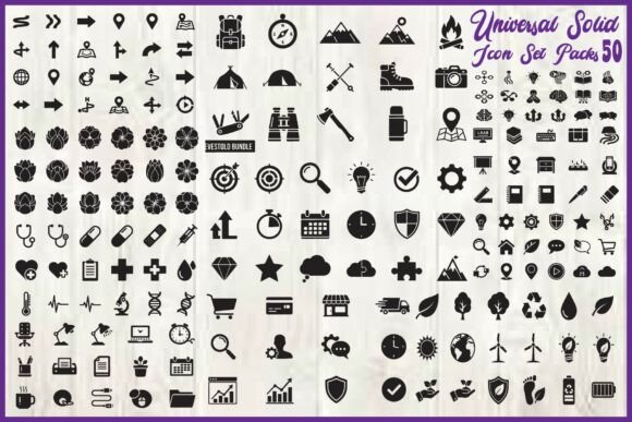
Universal Solid Icon Set for Strategic Design and Consistent Brand Communication
Every visual choice you make in a product, presentation, or brand asset either reinforces clarity or introduces noise. When you select icons, you are not just filling space—you are guiding attention, signaling meaning, and shaping how people navigate information. The Universal Solid Icon Set offers a deliberately restrained palette of 50 bold, black silhouettes designed to support exactly that kind of intentional work. Understanding what this collection contains and how to deploy it thoughtfully can save you time, reduce visual clutter, and strengthen the coherence of your projects.
This set covers navigation, maps, arrows, camping, tools, health, business, technology, nature, weather, shopping, education, UI symbols, and general-purpose elements. Each icon is rendered in a solid black style with clean, consistent vector shapes. The format options—SVG, EPS, PNG, and JPG—give you flexibility across platforms, while the uniform silhouette approach ensures that no single icon competes for attention more than another. That consistency is not just aesthetic; it is functional.
Why a Consistent Icon Style Supports Your Broader Goals
When you are building a dashboard, a mobile app, a website, or a set of printed materials, the visual system you choose either accelerates comprehension or adds friction. A solid black silhouette style, applied uniformly, reduces cognitive load because the viewer does not have to adjust to varying line weights, fill patterns, or stylistic flourishes. Every icon in this set speaks the same visual language, which means your audience spends less effort decoding and more time understanding.
For entrepreneurs and small business owners juggling multiple responsibilities, a consistent icon set eliminates the need to hunt for matching graphics across different sources. Instead of piecing together icons from various free repositories that clash in style, you can rely on one collection that already aligns. That alone saves hours of editing and reworking layouts. For marketers and creators, the benefit extends to brand positioning. A uniform icon language signals professionalism and attention to detail—two qualities that build trust with customers and stakeholders.
When you approach icon selection as a strategic decision rather than a decorative afterthought, you position your work to communicate more clearly. The Universal Solid Icon Set gives you a foundation for that clarity, but only if you use it with intention.
Planning Your Icon Usage Before You Start Designing
One of the most common mistakes professionals make is choosing icons reactively—grabbing whatever looks good in the moment without considering how it fits into the larger system. Before you open your design software, take time to map out where icons will appear and what role they will play. Will they primarily serve navigation in a mobile app? Will they support instructional content in a printable planner? Are they decorative accents in a presentation or functional elements in a dashboard?
Once you clarify the purpose, you can decide which icons from the set to use and whether any customization is needed. Because the icons are solid black silhouettes, recoloring them for different states—active, inactive, hover, or error—is straightforward. This makes them especially useful for UI and UX projects where states matter. For example, you might use the health icon in a primary color for a wellness app’s main feature and a muted gray for a secondary setting.
Planning ahead also helps you avoid overloading a layout with icons that compete for attention. The set includes 50 icons, but you rarely need all of them in one project. Select only those that directly support your message or function. If you find yourself forcing an icon into a spot where it does not quite fit, consider whether a simple label or symbol would serve better. Icons should clarify, not confuse.
Practical Use Cases Across Professional and Creative Contexts
The versatility of this icon set comes from its range of categories, but its real value lies in how those categories combine to support real-world tasks. Below are several scenarios where the collection can be deployed strategically.
User Interface and Dashboard Design
Dashboards require icons that are immediately recognizable at small sizes. A solid black silhouette style maintains legibility even when scaled down for navigation bars, sidebar menus, or data visualizations. The navigation, technology, and UI symbols in this set work well for common dashboard elements like settings, notifications, search, and user profiles. Because the icons are consistent, users can quickly learn what each symbol means, reducing the time they spend hunting for features.
When designing a dashboard for a business tool, you might pair the business and money-related icons with tool icons to represent different modules. The uniformity of the set ensures that a “settings” icon does not visually overpower a “reports” icon, which helps maintain a balanced interface.
Branding and Identity Materials
Brand guidelines often include a set of icons that reinforce the visual identity across touchpoints. Solid black icons are particularly useful here because they can be reversed out of dark backgrounds, embossed, or used in monochrome applications without losing their shape. The clean vector forms in this set adapt well to business cards, letterheads, website headers, and social media graphics.
If you are a freelancer building your own brand, you can select a handful of icons that represent your core services—perhaps the tools, technology, or business icons—and use them consistently across your portfolio and proposals. That repetition builds recognition and makes your materials feel cohesive without requiring a large budget for custom illustration.
Educational Materials and Infographics
Educators and content creators often need icons to break up text, illustrate concepts, or guide learners through a process. The education, nature, weather, and science-related icons in this set can be used in handouts, slide decks, or online courses. Because they are solid and bold, they reproduce well in both digital and print formats, including black-and-white printables where color is not available.
For example, a lesson plan on weather patterns could use the weather icons to represent different conditions, while the arrow icons could indicate direction or cause-and-effect relationships. The consistency of the set means the learner sees one visual system throughout, which supports comprehension.
Planners, Printables, and Digital Products
Productivity planners, habit trackers, and printable organizers benefit from icons that are simple enough to be printed at small sizes but clear enough to convey their meaning instantly. The camping, health, shopping, and general-purpose icons in this collection fit naturally into daily, weekly, or monthly layouts. A habit tracker might use the health icon for exercise, the nature icon for outdoor time, and the business icon for work tasks.
Creators selling digital planners on platforms like Etsy or Gumroad can use these icons to differentiate their products. Because the set comes in SVG format, you can resize and reposition each icon without quality loss, which is essential when adapting a single design to multiple page sizes or formats.
What to Consider Before Relying on an Icon Set
Even a well-designed icon set carries risks if used without context. The most common pitfall is assuming that an icon’s meaning is universal. While a shopping cart icon is widely understood in e-commerce, a camping icon might not be immediately clear to someone who has never camped or lives in a region where camping is uncommon. Before you commit an icon to a critical function—especially in a navigation menu or a user interface—test it with a small group of users or colleagues. Ask them what they think the icon represents without giving them hints. If the interpretation varies widely, consider adding a text label or choosing a different symbol.
Another risk is overusing icons to the point where they lose their signaling power. When every item on a page has an icon next to it, the visual weight becomes uniform and nothing stands out. Reserve icons for the most important actions, categories, or concepts. Let empty space and typography do the rest of the work.
Scalability is one of the advertised strengths of this set, and it is genuine—solid black silhouettes scale cleanly. However, ensure that your export resolution matches your use case. For web or app use, SVG is ideal because it scales automatically. For print, use the EPS or high-resolution PNG and JPG formats, and verify that the icon’s line weight remains visible at the intended print size.
Using the Set Intentionally for Long-Term Results
An icon set is not a one-time purchase; it is a resource that can serve multiple projects over time if you manage it well. Keep your files organized by category or project name so you can find what you need quickly. If you customize any icons—changing colors, adding outlines, or combining elements—save those variations separately so you do not lose the original.
For teams, establishing a simple icon usage guideline early prevents inconsistency. Decide whether icons will always appear on the left of a label, whether they will be filled or outlined in specific contexts, and what color palette they will follow. Document those decisions and share them with anyone who works on the project. This is especially important for agencies or in-house teams where multiple designers may touch the same files.
Over the long term, a consistent icon system becomes part of your brand’s visual memory. Users who encounter your app, website, or printed materials repeatedly will begin to associate specific icons with specific functions or values. That familiarity builds trust and reduces friction in every subsequent interaction.
Practical Steps to Get Started
- Review the full set of 50 icons and sort them by relevance to your current project. Remove or archive icons you do not plan to use so your working file stays clean.
- Choose one primary color and one secondary color for your icon states. Solid black works as a baseline; apply color only when you need to convey status or hierarchy.
- Test icons at multiple sizes—both smaller and larger than you think you will need—to confirm that the silhouette reads clearly at each scale.
- Pair icons with text labels in any user-facing interface until you have data showing that labels are unnecessary. This reduces ambiguity while users learn the system.
- Keep the SVG and EPS source files in a version-controlled folder so you can revert to originals if edits go wrong.
Integrating the Set into Your Broader Workflow
The Universal Solid Icon Set is not a standalone solution; it is one component of a larger design or communication system. Its value increases when you combine it with thoughtful typography, a consistent color palette, and a clear information hierarchy. If you are building a website, make sure the icon style matches the tone of your copy and the simplicity of your layout. If you are designing a presentation, let the icons punctuate your key points rather than crowding every slide.
For business owners and decision-makers, the strategic advantage of this set lies in its predictability. You know exactly what you are getting—50 icons that share the same weight, style, and format. That predictability allows you to plan faster, iterate with confidence, and hand off files to collaborators or contractors without worrying about compatibility. In an environment where time is scarce, reducing uncertainty in the design process is a real productivity gain.
Creatives and hobbyists will appreciate the flexibility to recolor and resize without technical barriers. The solid black silhouette is a neutral starting point that invites personalization. Add a texture, change the opacity, or combine two icons to create a composite symbol. The format supports experimentation, but always return to consistency when the project demands clarity.
Final Observations on Intentional Icon Use
Choosing an icon set is a practical decision, but using it well is a strategic discipline. The Universal Solid Icon Set gives you a foundation of bold, clean, and scalable symbols that can support a wide range of professional and creative work. However, the outcome depends on how thoughtfully you integrate those symbols into your goals, your audience’s needs, and your overall visual system.
Before you drop an icon into a layout, ask yourself: Does this icon make the meaning more clear or less clear? Does it fit the visual language of everything else in this project? Is it earning its place, or is it just decoration? Answering those questions honestly will guide you toward better decisions, better communication, and ultimately better results—whether you are building an app, designing a brand, or organizing your own workflow.